
.svg)

RESOURCE ARTICLE
What Is an Interactive Product Walkthrough: A Beginner-Friendly Guide
If you have ever launched a product, you already know the truth that building a good product is not enough. What matters just as much is whether users understand it, experience its value early, and feel confident using it without help.
This is where an interactive product walkthrough comes in.
At Uzera, we work closely with SaaS teams that struggle with user drop-off, low activation, and silent churn. In most cases, the product is not the problem. The experience of learning the product is.
This guide helps founders, product managers, marketers, and anyone new to the concept. By the end, you will clearly understand what an interactive product walkthrough is, how it differs from traditional product tours, and why it plays a critical role in product onboarding.
What Is an Interactive Product Walkthrough?
An interactive product walkthrough is a guided, in-app experience that helps users complete meaningful actions inside a product, step by step, in real time.
Contrary to static help articles or generic demos, an interactive walkthrough responds to what the user does. It prompts them at the right moment, explains why an action matters, and moves forward only when the user completes the step.
Think of it as a product teaching itself.
A well-designed interactive product walkthrough does three things:
- It shows users where to go
- It explains what to do
- It helps them experience value quickly
The key word here is interactive. Users are not just watching or reading. They are actively using the product while learning it.
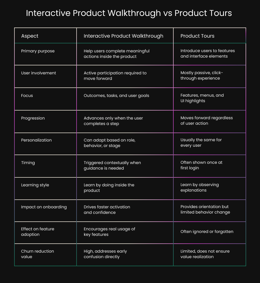
Interactive Product Walkthrough vs Product Tours
Many teams confuse interactive product walkthroughs with product tours. While they are related, they are not the same.
What Are Product Tours?
Product tours are usually linear, click-through guides that introduce features. They often appear as tooltips or modals layered over the interface.
Most product tours:
- Highlight menus or buttons
- Explain features at a high level
- Run the same way for every user
- End without requiring action
Product tours are useful for orientation, but they often stop short of driving real behavior.
How Interactive Walkthroughs Are Different
Interactive product walkthroughs are action-driven, not feature-driven. They are designed around tasks, outcomes, and user goals.
Key differences include:
- Users must complete actions to move forward
- The walkthrough adapts based on progress
- It focuses on outcomes, not features
- It integrates into product onboarding, not just introduction
In short, product tours tell users what exists. Interactive walkthroughs help users actually do something meaningful.
Why Interactive Product Walkthroughs Matter in Product Onboarding
Product onboarding is the process of helping users reach their first moment of value. This is often called the activation moment. Most products lose users before this moment happens.
Common onboarding problems we see include:
- Users feel overwhelmed by options
- Empty dashboards create confusion
- Setup steps feel unclear or optional
- Users do not know what success looks like
Interactive product walkthroughs solve these problems by guiding users through the exact steps that lead to value.
Instead of saying, “Here is your dashboard,” a walkthrough says, “Let’s complete your first task together.”
That shift makes all the difference.
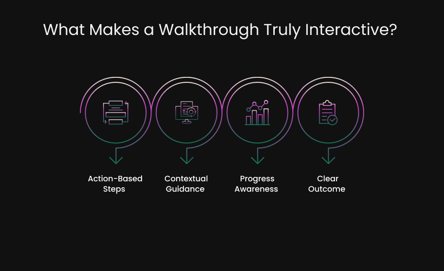
What Makes a Walkthrough Truly Interactive?
Not every guided experience qualifies as an interactive product walkthrough. To be effective, it must include specific elements.
1. Action-Based Steps
Each step should require the user to perform an action. This could be clicking a button, entering data, or completing a setup task.
Passive instructions do not create learning.
2. Contextual Guidance
Guidance should appear only when and where it is relevant. A tooltip that appears too early or too late loses impact.
Timing is critical.
3. Progress Awareness
Users should know how far they have come and what remains. Simple progress indicators build momentum and reduce drop-off.
4. Clear Outcome
Every walkthrough should lead to a clear result. This might be creating a project, inviting a teammate, or completing a first report.
Without an outcome, the walkthrough feels pointless.
Examples of Interactive Product Walkthroughs in Action
To make this concrete, here are a few real-world scenarios where interactive walkthroughs work best.
First-Time User Setup
A new user logs in and sees an empty product. Instead of leaving them to figure it out, the walkthrough guides them through initial setup in a few focused steps.
The user finishes setup and immediately sees something working.
Feature Adoption
A user has been active but has never tried a key feature. An interactive walkthrough introduces the feature at the right time and walks them through using it for the first time.
This drives deeper engagement.
Role-Based Onboarding
Different users have different goals. An admin, a contributor, and a viewer should not see the same walkthrough.
Interactive walkthroughs can adapt based on role or behavior.
How Interactive Walkthroughs Reduce User Churn
User churn often starts early, long before cancellation.
- It starts with confusion.
- It starts with hesitation.
- It starts when users feel unsure.
Interactive product walkthroughs reduce churn by building confidence early.
When users understand how to use a product and see value quickly, they are more likely to:
- Return after the first session
- Explore additional features
- Complete key workflows
- Stick with the product long term
Onboarding is not about explaining everything. It is about guiding users to success as fast as possible.
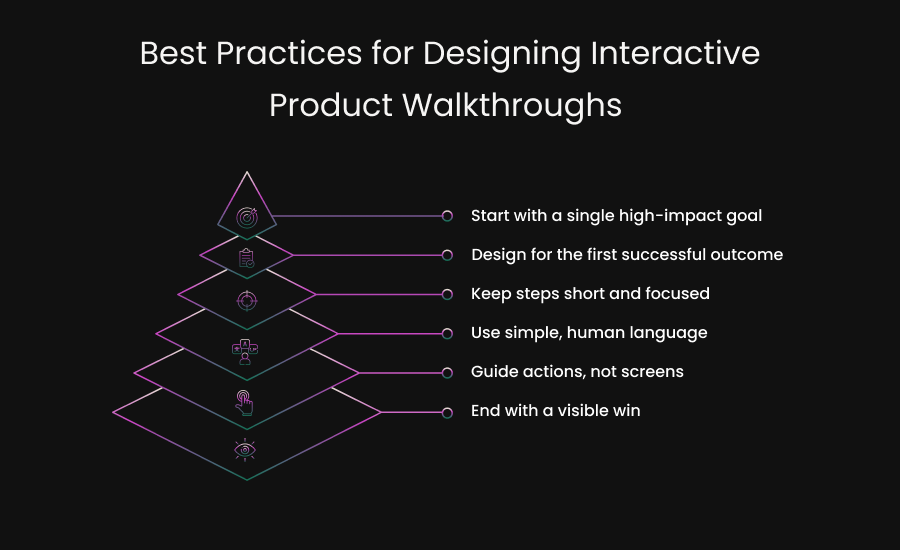
Common Mistakes Teams Make with Product Walkthroughs
Even good intentions can lead to poor experiences. Here are mistakes we frequently see.
Too Much Information
Trying to explain the entire product in one walkthrough overwhelms users. Focus on one goal at a time.
Feature-First Thinking
Users care about outcomes, not features. Walkthroughs should align with what users want to achieve.
One-Size-Fits-All Flows
Different users have different needs. Static walkthroughs fail because they ignore context.
No Measurement
If you are not tracking completion, drop-off, and impact, you cannot improve the experience.
How Interactive Walkthroughs Fit into a Broader Product Experience Strategy
Interactive product walkthroughs are not a standalone solution. They work best when combined with:
- Thoughtful product onboarding
- Contextual help and tooltips
- In-app messaging
- Behavior-based triggers
At Uzera, we view walkthroughs as part of an experience management system. The goal is not just activation, but long-term engagement and retention.
When onboarding, education, and guidance work together, users feel supported instead of pushed.
When Should You Use an Interactive Product Walkthrough?
An interactive product walkthrough becomes essential when users need guidance to move forward with confidence. If your product requires users to understand workflows, make decisions, or complete setup steps before seeing results, a walkthrough can remove hesitation and speed up progress.
You should strongly consider using interactive walkthroughs if:
Your product has a learning curve
Even well-designed products can feel complex to first-time users. When terminology, workflows, or setup steps are unfamiliar, users tend to pause or abandon the process. An interactive walkthrough breaks complexity into small, manageable actions and helps users learn by doing rather than guessing.
Users drop off during onboarding
If analytics show that users sign up but fail to complete onboarding, the issue is often uncertainty rather than lack of interest. Walkthroughs guide users through the most important first steps, reducing decision fatigue and helping them reach their first successful outcome faster.
Key features are underused
When powerful features remain untouched, it usually means users do not understand when or why to use them. Interactive walkthroughs introduce features in context, at the moment they are most relevant, making adoption feel natural instead of forced.
Support teams answer the same questions repeatedly
Recurring support questions are a signal that users are getting stuck at predictable points. Walkthroughs can address these friction areas inside the product itself, reducing support load while improving the user experience at the same time.
You want to reduce churn without adding friction
Churn often starts with early confusion or slow progress. Interactive walkthroughs reduce friction by providing guidance only when it is needed, without interrupting the user or forcing them through unnecessary steps.
At their best, interactive product walkthroughs scale what your strongest customer success manager would do if they could sit next to every user, understand their intent, and guide them through the right actions at the right time.
Key Takeaways
- Interactive product walkthroughs help users learn by completing real actions inside the product.
- Product tours explain features, while interactive walkthroughs drive actual usage and outcomes.
- Effective product onboarding prioritizes early value over complete product education.
- Reducing churn starts with removing confusion and hesitation during the first product experience.
- The best walkthroughs are timely, action-driven, and designed around a clear user goal.
Start Guiding Users to Value Instead of Explaining Features
Products fail quietly when users do not understand them. Interactive product walkthroughs are not about showing off features. They are about helping users succeed.
When done right, they create clarity, confidence, and momentum. They turn first-time users into active users. They turn confusion into progress.
If you want your product onboarding to work harder without adding friction, an interactive product walkthrough is one of the smartest places to start.
At Uzera, this belief shapes everything we build.
Ready to Turn Onboarding Into a Guided Experience?
Interactive product walkthroughs help users move forward with confidence, experience value sooner, and stay engaged longer. When guidance is built into the product, onboarding stops feeling like a hurdle and starts working as part of the experience.
See how Uzera supports interactive product walkthroughs that drive adoption, reduce churn, and improve product onboarding.
Frequently Asked Questions
What is the main goal of an interactive product walkthrough?
The main goal of an interactive product walkthrough is to help users complete meaningful actions inside the product so they can experience value quickly. It focuses on guiding behavior, not just explaining features.
Are interactive product walkthroughs only useful for new users?
No. While they are critical for new user onboarding, interactive walkthroughs are also effective for introducing new features, guiding advanced workflows, and helping existing users adopt underused functionality.
How long should an interactive product walkthrough be?
An effective walkthrough should be as short as possible while still leading to a clear outcome. Most successful walkthroughs focus on one goal and can be completed in a few steps rather than covering the entire product.
Do interactive product walkthroughs replace help documentation or support teams?
No. Interactive walkthroughs reduce reliance on support by addressing common questions inside the product, but they work best alongside help documentation and customer support as part of a complete onboarding and education strategy.


.svg)

