
Traditional analytics misses that 72 percent of visitors stop at the hero. Your CTA below the fold goes unseen. Heatmaps make user focus visible instantly, guiding smarter placement of CTAs and content.
Heatmaps highlight patterns such as click activity, scroll depth, and issues like dead clicks or rage clicks.
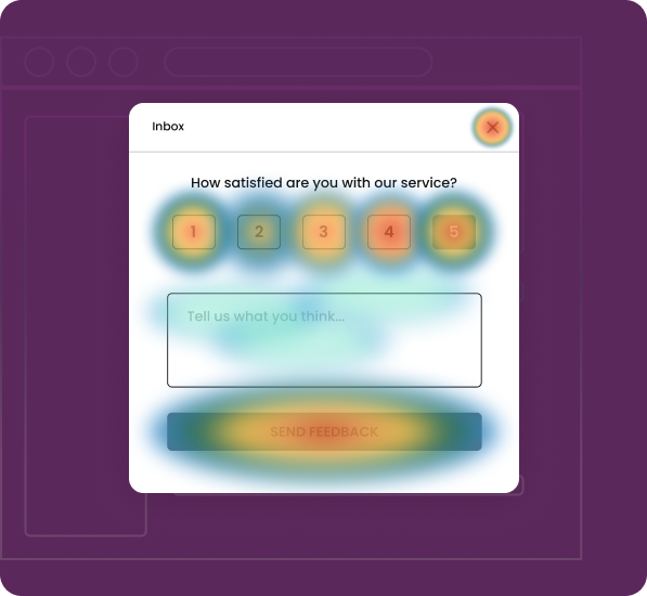
Warm colors like red, orange, and yellow show high activity. Cool colors like blue, green, and purple show low or no interaction.
.svg)
A lightweight JavaScript snippet tracks clicks, scrolls, mouse movements, and taps. It aggregates hundreds or thousands of sessions into one visual.
.svg)
Instead of parsing spreadsheets and pivot tables, you can see where attention clusters, where engagement drops, and where visitors act unexpectedly.
.svg)
Analytics tell you how many people bounced. A heatmap shows you where on the page their experience broke down.
.svg)
Traditional analytics tell you how many people bounced. A heatmap shows you where on the page their experience broke down. One gives you the score. The other player gives you the game film.
Not all heatmaps capture the same data. Each type answers a different question about your visitors' behavior.
Record where visitors click (on desktop) or tap (on mobile) on your page. They reveal which elements attract interaction, which links get ignored, and which non-clickable elements visitors are trying to click on.
.svg)
Start here for any page with a conversion goal. Answer the question: "Are people interacting with what I need them to interact with?"
.svg)
Dead clicks indicate non-clickable elements being tapped. Rage clicks show user frustration. Ghost clicks happen when elements shift or load slowly.

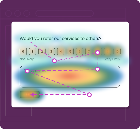
Display how far down the page visitors scroll. They use a gradient from warm to cool colors, with the warmest colors at the top and the coolest at the point where most visitors stop scrolling.
Use on long-form pages like landing pages, blog posts, product pages, and pricing pages. See if your key content is actually being viewed.
The "fold line" where attention sharply drops. On most pages, there's a specific point where you lose 40% to 60% of your audience.
Track cursor movement across the page on desktop devices. Research shows a correlation between cursor position and eye fixation; users tend to move their mouse near the content they're reading or considering.
Use content-heavy pages—articles, comparison tables, feature lists, and documentation—to understand scanning behavior.
Hovering without clicking often signals hesitation or confusion. If cursor activity concentrates around a pricing table but clicks never follow, the visitor may need additional information.
Heatmaps serve anyone responsible for a website's performance, but different teams extract different kinds of value.

Treat heatmaps as the starting point for optimization. Review click and scroll heatmaps before launching an A/B test to find friction points.
Without this step, A/B tests often test the wrong variables, changing button color when the real problem is button placement.

Heatmaps provide real behavioral data to confirm or question your design assumptions.
Navigation menus that look intuitive in a wireframe often confuse real users who click category labels expecting dropdowns that don't exist.

Heatmaps reveal how users interact with new features and highlight barriers to adoption.
A heatmap often reveals that users are simply not seeing the entry point—it's lost in a sidebar or buried below more prominent elements.

Use heatmaps to optimize product pages, collection pages, and checkout flows. Identify where visual elements compete with conversion goals.
A recurring pattern shows product images getting high click activity. The "Add to Cart" button below gets almost none because the image gallery dominates visually.

Use scroll heatmaps to understand how far readers actually get through articles and guides. The data is often humbling — fewer than 30% of visitors reach the midpoint of an article on many content sites.
Use heatmap insights to optimize content layout. Position CTAs and important information where users naturally focus.
Understanding the technical mechanics helps you evaluate tools more critically, set up recordings correctly, and interpret data with appropriate nuance.
.svg)
A lightweight JavaScript snippet is installed on your site via direct code or a tag manager. It passively tracks clicks, taps, scrolls, cursor movements, and some forms of interactions and errors.
.svg)
After collecting data from many user interactions, the heatmap tool groups them into density layers. High activity areas appear in warm colors. Low activity areas appear in cool colors. The heatmap is overlaid on your webpage so behavior is seen in context.
.svg)
The heatmap tool organizes session data into visual layers, highlighting areas of high interaction with warm colors and low interaction with cool colors. This overlay on your webpage provides clear insights into user behavior.

User behavior varies across desktop, tablet, and mobile. Heatmap tools should show separate visuals for each device. A CTA visible on a 1440-pixel desktop may be off-screen on a 375-pixel mobile.
Heatmap insights only matter when they lead to changes that move metrics. Here are four scenarios where heatmap data drove specific, measurable outcomes.
An e-commerce brand running paid campaigns to a product landing page was converting at 1.4%.
Scroll heatmap data showed that 61% of visitors never scrolled past the hero section — meaning nearly two-thirds of paid traffic never saw the primary CTA, which was positioned below a lengthy feature description.
Moved the CTA into the hero section, reduced the feature description to two sentences with a "Read more" toggle, and added a secondary CTA near the scroll drop-off point.
Conversion rate increased to 2.9% within three weeks.

A SaaS company redesigned their marketing site navigation from a traditional top bar to a sidebar layout. Post-launch analytics showed that overall page-per-session metrics dropped 22%.
Click heatmap data revealed visitors were clicking on the company logo (expecting it to act as a home button) but ignoring the sidebar navigation entirely. Mouse movement heatmaps confirmed cursor activity concentrated on the top of the page.
Reverted to a top navigation layout with improved category labels.
Pages per session recovered within one week and eventually exceeded pre-redesign levels.

An online retailer noticed their highest-traffic product page had a below-average add-to-cart rate.
Click heatmap data showed that the product image gallery captured 78% of all click activity on the page. The "Add to Cart" button, positioned directly below the gallery, received only 4% of clicks. Attention heatmap analysis confirmed visitors were spending the vast majority of their engaged time interacting with image zoom and gallery navigation.
Pinned a persistent "Add to Cart" bar to the bottom of the mobile viewport and repositioned the desktop CTA to the right of the image gallery rather than below it.
The add-to-cart rate increased significantly.

A B2B company's lead generation landing page was converting at 3.1% — reasonable, but below their target.
Click heatmap data showed normal engagement with the form's first three fields (name, email, and company). But the fourth field — "Annual Revenue" — showed almost zero interaction. Visitors were reaching the form and engaging with earlier fields but stopped at field four.
Removed the annual revenue field (which the sales team admitted they rarely used) and shortened the form to three fields.
Conversion increased from 3.1% to 5.7%.
Heatmaps are intuitive — sometimes dangerously so. The visual simplicity that makes them powerful also makes them easy to misinterpret. Avoid these common traps.


A heatmap based on 50 visits can produce patterns that look meaningful but are actually noise.
.png)
For pages with moderate traffic, aim for at least 1,000 sessions before treating heatmap patterns as reliable. For high-stakes pages like checkout flows, 2,000 to 5,000 sessions provide more confidence.

A combined desktop-and-mobile heatmap averages fundamentally different behaviors into a single view, which often produces misleading visualizations. A CTA that performs well on desktop might be completely invisible on mobile.
Always review heatmaps by device type separately. Set up specific views for desktop, mobile, and tablet.

High click volume on an element doesn't mean that element is contributing to your business goal. A product filter that gets hundreds of clicks but doesn't lead to higher purchase rates is generating activity, not value.
Pair click heatmaps with conversion data to distinguish productive engagement from noise. Track which clicks actually lead to desired outcomes.

Mobile visitors often exhibit dramatically different scroll patterns than desktop users — they tend to scroll further but engage less deeply with individual sections. If you're only reviewing desktop scroll heatmaps, you're optimizing for the wrong audience.
Dedicate equal attention to mobile scroll patterns. Understand how mobile users consume your content differently.
User behavior changes over time — seasonal traffic shifts, campaign mix changes, design updates, and new content all reshape how visitors interact with your pages.
Establish a regular review cadence (weekly for high-traffic pages, monthly for secondary pages) to catch behavioral changes early.
Your heatmap tool collects behavioral data about every visitor on instrumented pages. Deploying a tool without confirming it holds current SOC 2 Type II attestation and ISO 27001 certification creates an unnecessary security gap.
Always verify that your heatmap vendor maintains current SOC 2 Type II and ISO 27001 certifications before deployment.
You don't need to instrument every page on your site from day one. A focused, phased approach gets you to actionable insights faster and builds organizational momentum around data-driven optimization.
Identify five to ten key pages that directly drive revenue or lead generation, such as product pages, pricing pages, landing pages for paid campaigns, and primary conversion funnels, and install the heatmap script on them first.
Pick five to ten key pages like product pricing landing and funnel pages and install the heatmap script on them first
Review click, scroll, and movement heatmaps for each priority page. For each page, note where engagement is strongest, weakest, and where behavior does not match your design intent.
Rank changes by expected conversion impact and ease of implementation. Validate each change with A/B testing, then confirm behavioral shifts through updated heatmaps.
Once core pages are optimized and a heatmap review process is in place, expand tracking to secondary pages like blogs support docs secondary landing pages and internal product screens and include heatmap review in regular sprint or campaign retrospectives

A heatmap aggregates behavioral data from hundreds or thousands of visitors into a single visual overview of a page. It shows patterns and trends where most people click, how far most people scroll, which areas capture the most engagement. Session replay, by contrast, records individual user journeys as video like playbacks. Use heatmaps to identify problem areas, then use session replay to investigate why individual users behave the way they do in those areas.
For most pages, 1,000 to 2,000 sessions provide statistically meaningful patterns. High-traffic pages can produce useful heatmaps in as little as 24 hours. Lower-traffic pages may need one to two weeks of data collection. The key is to avoid acting on heatmap data from fewer than a few hundred sessions — early patterns often shift as more data accumulates.
Modern heatmap tools are designed for minimal performance impact. The tracking scripts operate asynchronously and typically add less than 1% to page load time. However, implementation quality matters. Always test your Core Web Vitals metrics before and after installation to confirm no negative impact on Largest Contentful Paint, Cumulative Layout Shift, or Interaction to Next Paint.
Yes. Most modern heatmap platforms capture mobile tap data, tablet interactions, and desktop mouse behavior as separate data sets with device-specific visualizations. Because mobile layouts often differ substantially from desktop layouts — different element positions, hidden menus, compressed content — always review mobile and desktop heatmaps independently.
When your heatmap vendor holds SOC 2 Type II attestation and ISO 27001 certification, the answer is yes. SOC 2 Type II confirms that security controls — access management, encryption, incident response, and monitoring — have been independently verified as effective over an extended audit period. ISO 27001 certification demonstrates a comprehensive, organization-wide information security management system maintained through annual surveillance audits. Together, these credentials satisfy vendor risk assessment requirements for enterprise procurement and regulated industries.
Heatmaps capture interaction coordinates — where clicks, scrolls, and mouse movements occur on a page — aggregated across many sessions. They do not inherently capture personally identifiable information like names, emails, or account details. Reputable tools also provide automatic masking for any form fields or page elements that might display sensitive data, ensuring PII is excluded from recordings at the point of capture.
Both — in sequence, not as alternatives. Heatmaps reveal where problems exist and help you form hypotheses about what needs to change. A/B testing validates whether your proposed change actually improves the metric you care about. Running A/B tests without heatmap insights often means testing the wrong variables. Running heatmap analysis without A/B testing means implementing changes without measuring their true impact.
Most optimization workflows require 30 to 90 days of data retention. Seasonal businesses benefit from longer retention to compare behavior across different time periods. Your data retention policy should align with your organization's security requirements and the retention commitments documented in your vendor's SOC 2 report and ISO 27001 framework.
Every page is a conversation between your design and your users but most of it is invisible. Users signal intent through clicks, scrolls, and hesitation, while dashboards only show exit rates. Heatmaps surface these behaviors and turn them into actionable patterns. The fastest teams act on data, not intuition.

.svg)


.svg)

